Semi /+ Detached House
The existing house is a typical corner lot semi-D with plenty of open compound. The client has purchased the empty lot behind, planned for alteration and extension to the existing house and fully utilised the compound. Most outdoor compounds were under-utilised due to tropical climate condition and owner disliked heavy maintenance to landscape. He is quite keen to extend the house for family of 2 adults, 3 grown up kids and a maid, yet maintaining a reasonable size for his wife to take care.
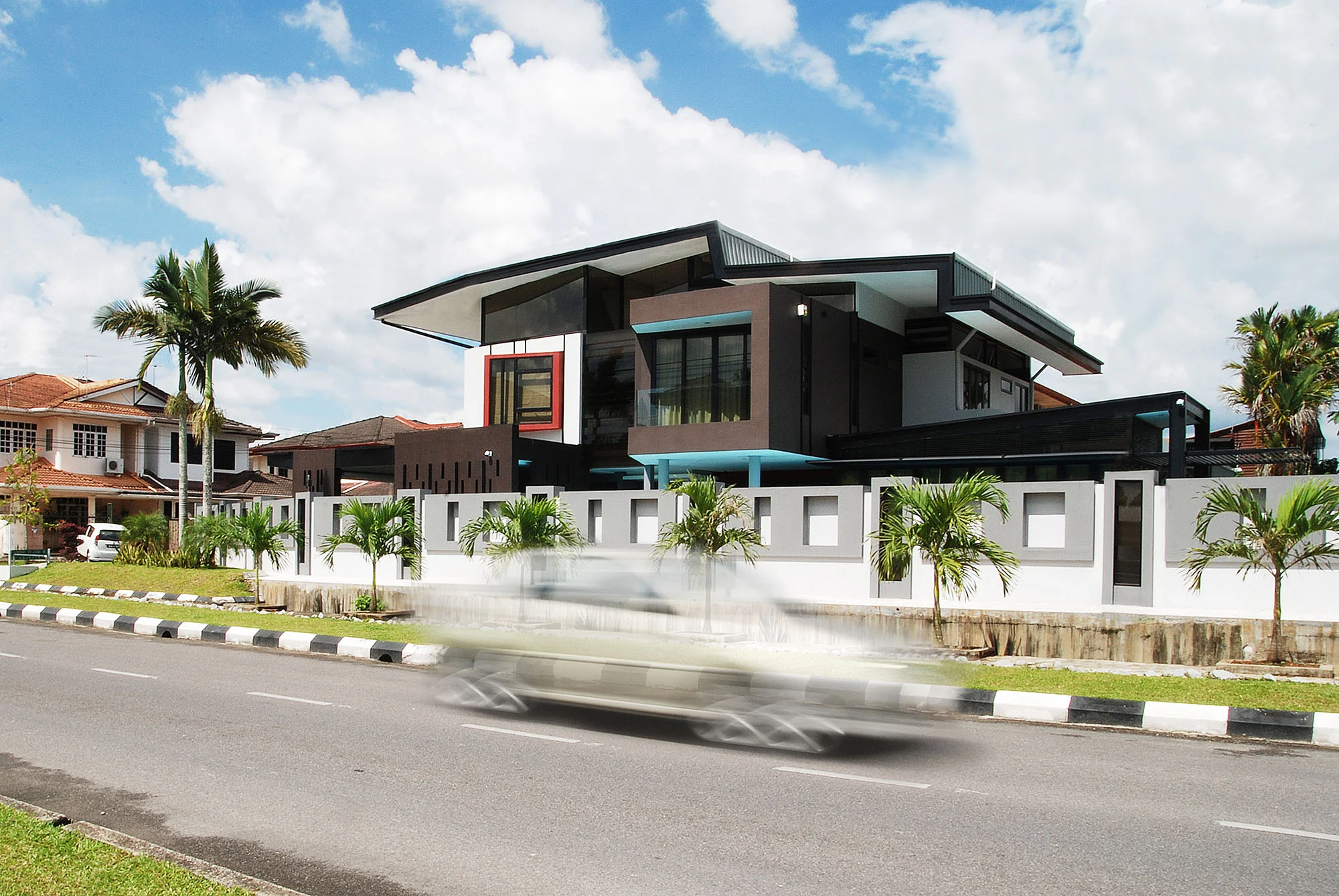
Spaces required include a clubhouse for leisure facilities for occasional gathering and party with friends, separate access and additional car parking for guests without interrupting private living of the family and an additional 1 room on the 1st floor and all rooms with detached bathroom. The client also requested that the house would look like a detached house. With his strong-will to remain staying in the neighbourhood yet own an identical house among the typical housing architecture, the project is attempted to challenge the typical Semi-D prototype. Also is about making a statement or milestone for the client’s discovery of life and taste from a “Kampung boy” to a successful businessman who gained lots of exposure by travelling.
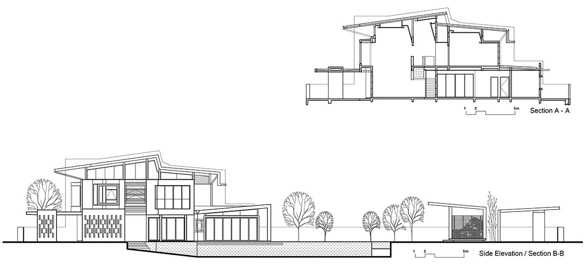
This overall building form mimicry the Gunung Serapi, a well known geographical landmark which can be seen from most area in Kuching. Adopting the same approach, this house is intentionally designed as a landmark with an injection of nature element along the streetscape.
The roof design has been carried out through a process of testing and combining different roof profiles exist in the neighbourhood from 80’s to 90’s. The roof is oriented with visual angle directed towards the traffic approach from the main road. With that, it is all about attempting to give the community with some reminder or imagination about the mountain intentionally and unintentionally.
The side elevation is treated to enhance the visibility and attention significantly while the north and south entrance to the house have been treated carefully for not overwhelming the side facade facing the main road. On the 1st floor, more unexpected perspective angles will be previewed and the massing is appeared as a floating object with distorted effect from scenic drive through experience from two directions along the main road.
Most spaces and circulation was designed to adhere to the existing living style and familiarity without much adverse impact, and the total built-up area is kept within 15 percent increase. On the ground level, a double volume space is introduced to improve natural lighting in living room. On the 1st level, ceiling follows the roof profile with pockets of high windows all round to lighten up the hallway.
Interactive semi outdoor areas are extended onto the compound, linking with pool on the west and teahouse on the north end. These leisure spaces tend to improve visual connectivity and spatial relationship between indoor and outdoor yet separating the family zone and the guest zone.
Colours were chosen to highlight the plasticity of the components, continuity of layers and surfaces; black linear strips on facade and black window frames as primary elements of the facade, that reminds the facade treatment of the black and white house mansion.
We envisioned the house that is free from association with the typical Semi-D along the streetscape. sThe facades are components of volumes purposely extruded from, and seen as gliding past one another. This enabled the provision of balconies and pocket window.


